CSS Flex in a Nutshell
Flex, also referred as flexible box, flexbox or flex layout, is a one dimensional layout in CSS. Elements inside flexbox are placed along one axis. Compared to using position for elements arrangement, using flex is much easier.
Flex elements
There are two kinds of flex elements:
- Flex container: element with
display: flexordisplay: inline-flexattribute.display: inline-flexmakes the flex container display inline.
- Flex item: A direct child elements of a flex container is a flex items.
Flex axes
Flex items flow through one dimension, which is called main axis. The main axis is defined by the flex-direction propery. Another axis that perpendicular to main axis is called cross axis.
The flex-direction property has four possible values and they corresponded to x+, x-, y+, y-, respectively:
- row
- row-reverse
- column
- column-everse
Flex items will run along the row in the inline direction: Flow direction: row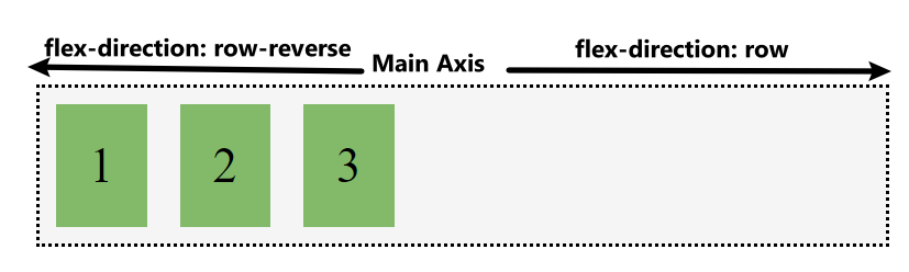
Flex items will run along the column in the block direction: Flow direction: column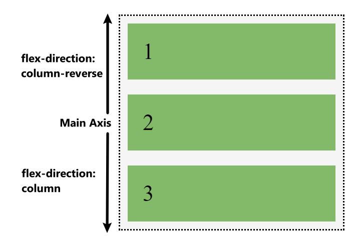
Start and end
Flex layout makes no assumption of left to right writing mode. Flex items are arranged from start to end instead of from left to right.The start and right are determined with Start and endflex-direction. This concept also helps to understand how flex items alignment and justification works.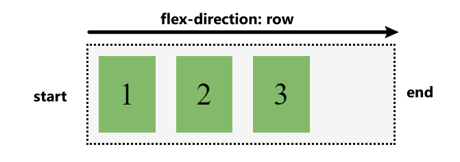
Flex properties
Flex has 3 properties provide granular control for flex items:
flex-grow- flex item can grow along the main axis from their
flex-basis - this will cause the item to take up any available space on that axis
- set to positive proportional integer value
- flex item can grow along the main axis from their
flex-shrink- flex item can shrink along the main axis from their
flex-basis - set to positive proportional integer value
- flex item can shrink along the main axis from their
flex-bais- defines the default size of flex item in terms of the space it leaves as available space
- the initial value is
auto, value can be also a length(e.g. 0%, 5rem, etc) - if not set, the content’s size is used as the flex-bais
Shorthand values for the flex properties
flex-grow, flex-shrink, flex-basis are usually used together as a combined flex shorthand form. The flex shorhand sets the three properties in this order - flex-grow, flex-shrink, flex-basis: e.g. flex: 1 1 auto;
This is the most important part to understand flex layout in my oppinion and I am listing common flex shorthand with their meanings below:
flex: 0 1 auto: this is the inital value of flex, it allows a flex item to shrink but not grow, taking account its initial sizeflex: 1 1 auto: this allows a flex item to grow and shrink, taking account its inital sizeflex: 1 1 0%: this allows a flex item to grow and shrink as needed, ignoring its inital size.flex: none: prevent a flex item to grow and shrink
Alignment and justification between items
The key feature of flex layout is the ability to align and justify flex items on the axes, and distribute space between flex items. This is hard to be done through old position method.
justify-contentproperty is used to align flex items on the main axis.- value can be set to:
stretch,flex-start,flex-end,center
justify-content: image from css-tricks.com
- value can be set to:
align-itemsproperty is used to align flex items on the cross axis.- value can be set to:
flex-start,flex-end,center,space-around,space-between,space-evenly
align-items: image from css-tricks.com
- value can be set to: